SuperchartinEvidence and ThoughtHow to Embed Data Visualizations into WordpressBusinesses of all sizes are integrating data analytics into various systems and processes, including their public-facing websites. Data…May 10, 2023May 10, 2023
SuperchartinEvidence and ThoughtHow to Create an Analytics Dashboard in WebflowBusinesses of all sizes are integrating data analytics into various systems and processes, including their public-facing websites. Data…May 10, 2023May 10, 2023
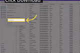
SuperchartinEvidence and ThoughtCan You Export Airtable to Excel?Airtable is a highly versatile tool that offers impressive capabilities. It generally exceeds user expectations in ease of use and…May 10, 2023May 10, 2023
SuperchartinEvidence and ThoughtHow To Create a Bar Chart in Google Sheets — SuperchartBar charts are the most frequently used data visualization. Bar charts are great visualizations to compare categories or groups within a…May 10, 2023May 10, 2023
SuperchartinEvidence and ThoughtHow To Create a Scatter Plot Using Google Sheets — SuperchartScatter plots plot two sets of data points on an x-y coordinate plane, making it easy for users to identify correlations. They can help…May 10, 2023May 10, 2023
SuperchartinEvidence and ThoughtWhat is Airtable Used For — SuperchartAirtable is a versatile tool that can be used for a variety of purposes. For instance, some of the most common use cases for Airtable are…May 10, 2023May 10, 2023
SuperchartinEvidence and ThoughtAirtable Basics — SuperchartThe very basics of Airtable. Mostly definitions and a quick summary of the major elements. If you’re looking for more how-to’s and visual…May 10, 2023May 10, 2023
SuperchartinEvidence and ThoughtWhy Airtable? — SuperchartAirtable is a powerful cloud-based database platform that makes it easy to organize, store and collaborate on data. It combines the…May 10, 2023May 10, 2023
SuperchartinEvidence and ThoughtHow to Make a Pie Chart in Google Sheets — SuperchartGoogle Sheets’ pie charts are a great way to showcase how categories (or slices of the pie) contribute to a larger whole. Not only do they…May 10, 2023May 10, 2023
SuperchartinEvidence and ThoughtHow to Make a Chart in Google Sheets — SuperchartCreating charts on Google Sheets is a useful way to visualize and interpret data. This platform offers users the ability to rapidly build…May 10, 2023May 10, 2023